Published: Tuesday 17 December 2019

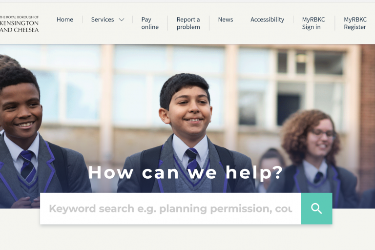
After months of hard work we are really excited to have launched the first phase of our brand new Council website.
We'd like to thank all those residents who have helped shape the new website over the past year right from the discovery exercise through to user testing.
The website is still very much a work in progress and residents may notice a hint of the old website when trying to carry out various tasks.
However, we have completed a large amount of the work. This first phase showcases newly designed pages including the homepage, news area, service hubs and main content pages as well as improved content and a more intuitive search facility to help you find what you are looking for much more easily and quickly.
Following consultation with residents earlier this year, our focus was to make sure the website was easier to navigate, transact with and use. We have also modernised it after you told us it was too corporate, bland and stuffy.
So, as well as a new bright colour palette and bespoke icons to help signpost you to essential services, the site has also been brought to life with new photographs of local people and places. Thank you to all the local residents who agreed to be photographed.
An audit of every single page across the site has been carried out and we have deleted almost half of the content. We have also started the content improvement project and made significant improvements to the readability of those pages as well as enhancing accessibility, making it easier for residents with impairments to use across a range of devices and browsers. The content improvement project will continue in the next phase.
Extensive user testing of the new site over the past couple of months with residents and RBKC staff who live in the borough resulted in a number of improvements ahead of the site going live this week.
We still have lots to do and will be looking to ensure all transactional services such as MyRBKC account as well as website forms reflect the new look and feel.
Cllr Mary Weale, Lead Member for Finance, said: The improvements to the website have been driven by input from residents and their involvement has helped us enormously. The new website not only looks much better but also has a better search function and easier transactions. It is still very much work in progress and resident contributions as it evolves will be key to its success. Thank you to everyone who has taken the time so far to help to shape it and please keep giving us feedback.”
If you would like to be involved in the testing of the next phase, please email [email protected] and we will be in touch.
